Appearance
Forge HQ Dashboard Tour
Understanding Your Window Into the Planetary Compute Network
Forge HQ is the control plane for everything you do with Forge Pool:
- organizations and projects,
- API keys and limits,
- nodes and agents,
- jobs, metrics, and credits.
This page gives you a visual tour of the main Dashboard view so new users don’t get lost on day one.
1. Layout at a Glance
The Dashboard is split into three main areas:
- Top bar – global controls and context.
- Left sidebar – navigation between sections.
- Main canvas – organization-wide KPIs, charts, and tables.
If you have multiple organizations, the top-left org selector changes the entire context of the dashboard.
2. Top Bar
- Organization selector
Choose which organization you’re currently managing. - Quick Search
Search for jobs, nodes, projects, and adapters. - Notifications
Status updates, incidents, important messages. - Profile / Account menu
Personal settings, API tokens (for user-scoped features), sign-out. - Nodes & Billing shortcuts
Icons that jump straight to Nodes and Billing & Credits for fast access.
3. Left Sidebar Navigation
The sidebar groups everything into a few logical clusters.
Workspace
- Dashboard – the view described on this page.
- Activity Stream – high-level log of jobs, nodes, and org events.
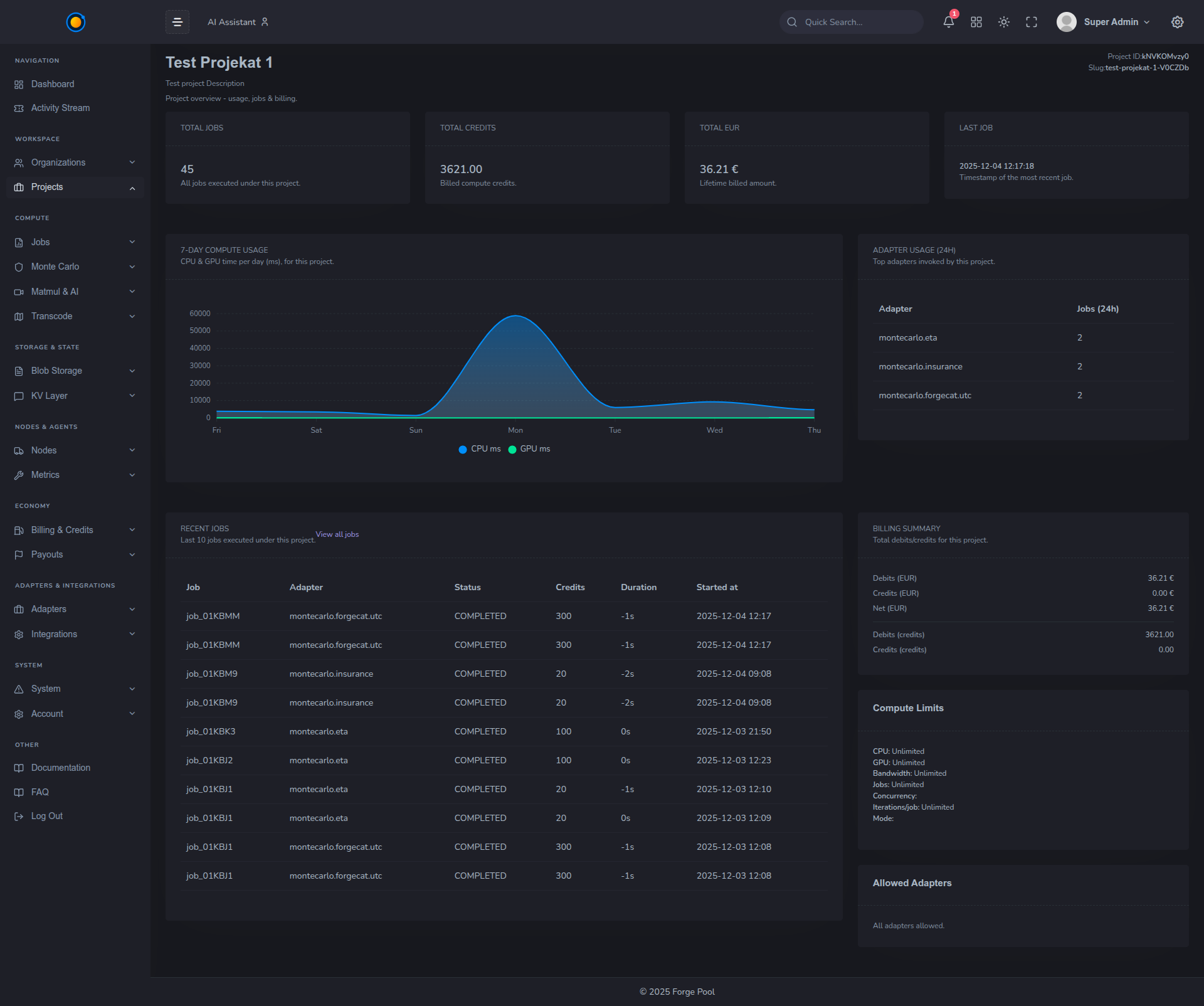
- Organizations / Projects – structure of your tenant.
Compute
- Monte Carlo – views and tools around risk-style workloads.
- MatMul & AI – numeric / BLAS workloads and AI inference (where enabled).
Storage & State
- Blob Storage – Forge Blob buckets and objects.
- KV Layer – planetary key–value store used by adapters and workflows.
Nodes & Agents
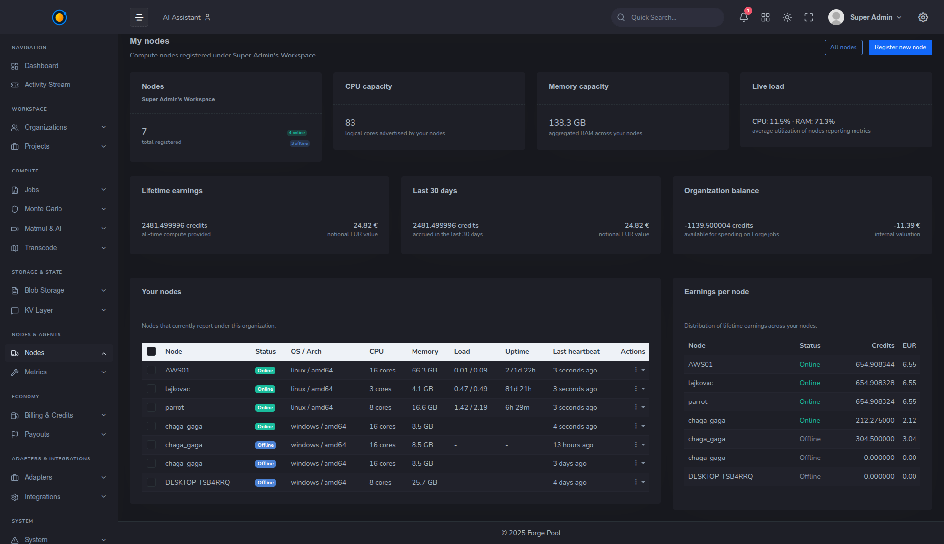
- Nodes – list of all Agents registered to this organization: status, metrics, reputation, and earnings.
- Metrics – detailed charts for CPU/GPU, throughput, and errors.
Economy
- Billing & Credits – balances, invoices, credit packages.
- Payouts – provider earnings and payout history.
Adapters & Integrations
- Adapters – which adapters are enabled for your org.
- Integrations – Samsara, weather APIs, finance feeds, and more.
System
- Account / Settings – org-level configuration, IAM, API keys.
- Documentation / FAQ – shortcuts to docs (this site).
4. Dashboard KPIs
At the top of the main canvas you’ll see several summary cards:
- Active jobs – how many jobs are running or queued right now.
- Jobs (24h) – completed jobs in the last 24 hours.
- Nodes online – nodes currently connected and healthy.
- Available credits – your remaining credit balance.
These numbers answer: “Is the org healthy and are we burning compute?” at a glance.
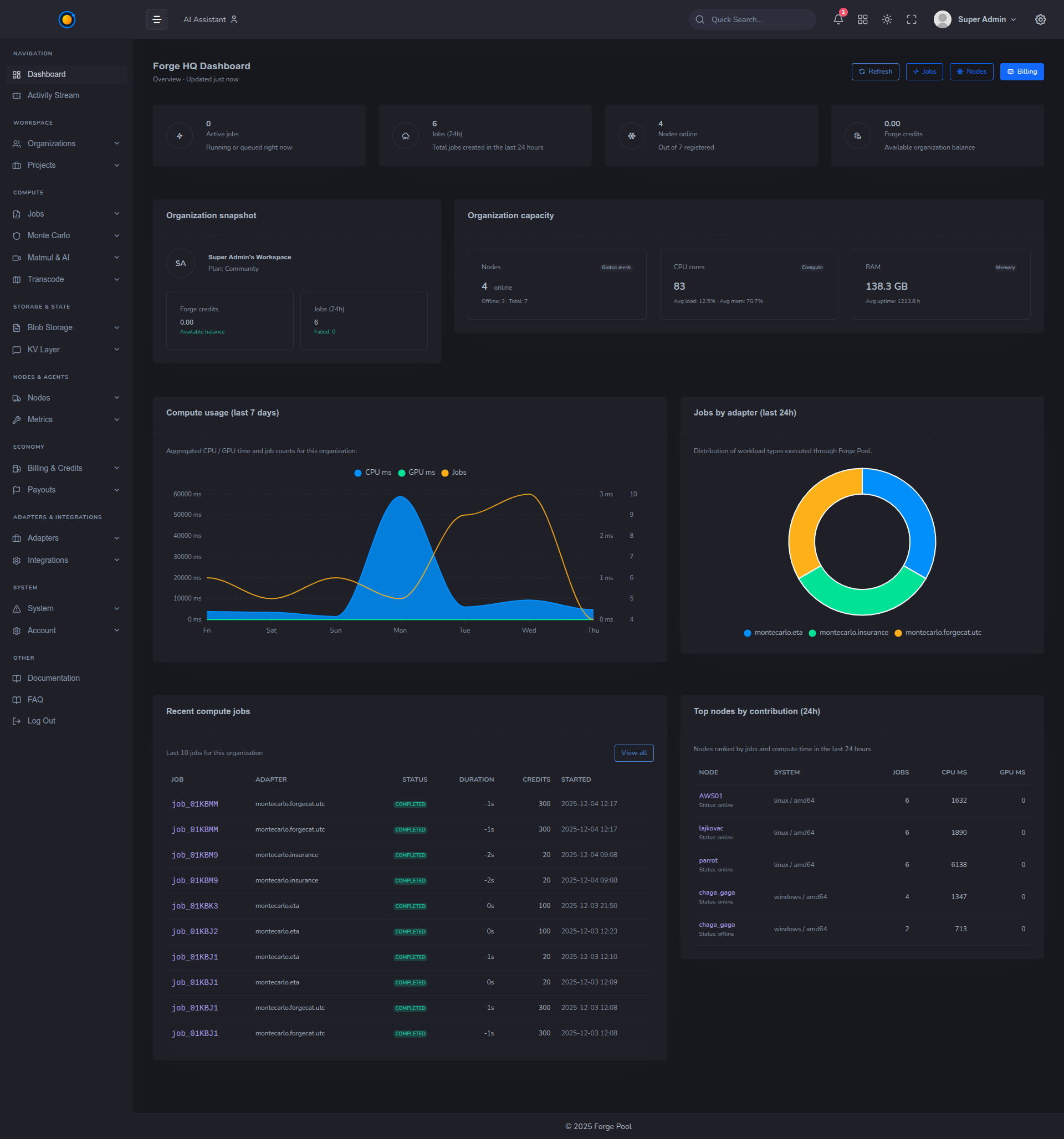
5. Organization Snapshot & Capacity
Organization Snapshot
Shows:
- which workspace / tenant you’re in,
- high-level job count,
- compute volume and credits consumed.
Good for quick sanity checks before you start debugging.
Organization Capacity
Summarizes the raw power available to the scheduler:
- number of online nodes,
- total CPU cores / GPU units,
- total RAM available to the pool.
As nodes join or leave, this panel updates, giving you a live view of how much horsepower you can tap into.
6. Compute Usage (Last 7 Days)
A stacked area chart showing:
- CPU ms,
- GPU ms,
- job counts
aggregated per day.
Use this to:
- spot traffic spikes,
- compare weekdays vs weekends,
- see the effect of new features or integrations that use Forge Pool.
Hovering over a point reveals exact values and breakdown.
7. Jobs by Adapter (Last 24h)
A donut / pie chart that shows how your jobs split by adapter:
montecarlo:insurance,montecarlo:eta,blas:matmul,ffmpeg:transcode,- custom adapters.
This helps answer:
- “What are we actually using Forge Pool for?”
- “Which team or workload family drives most of our spend?”
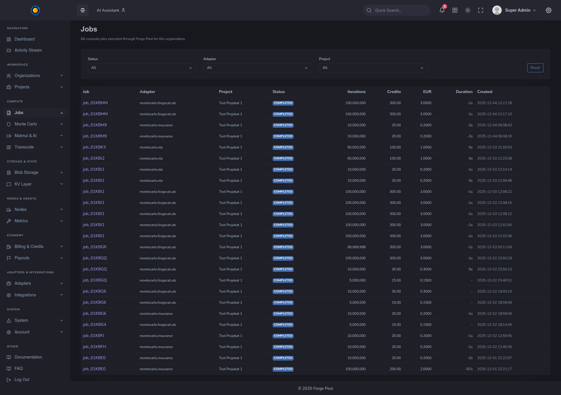
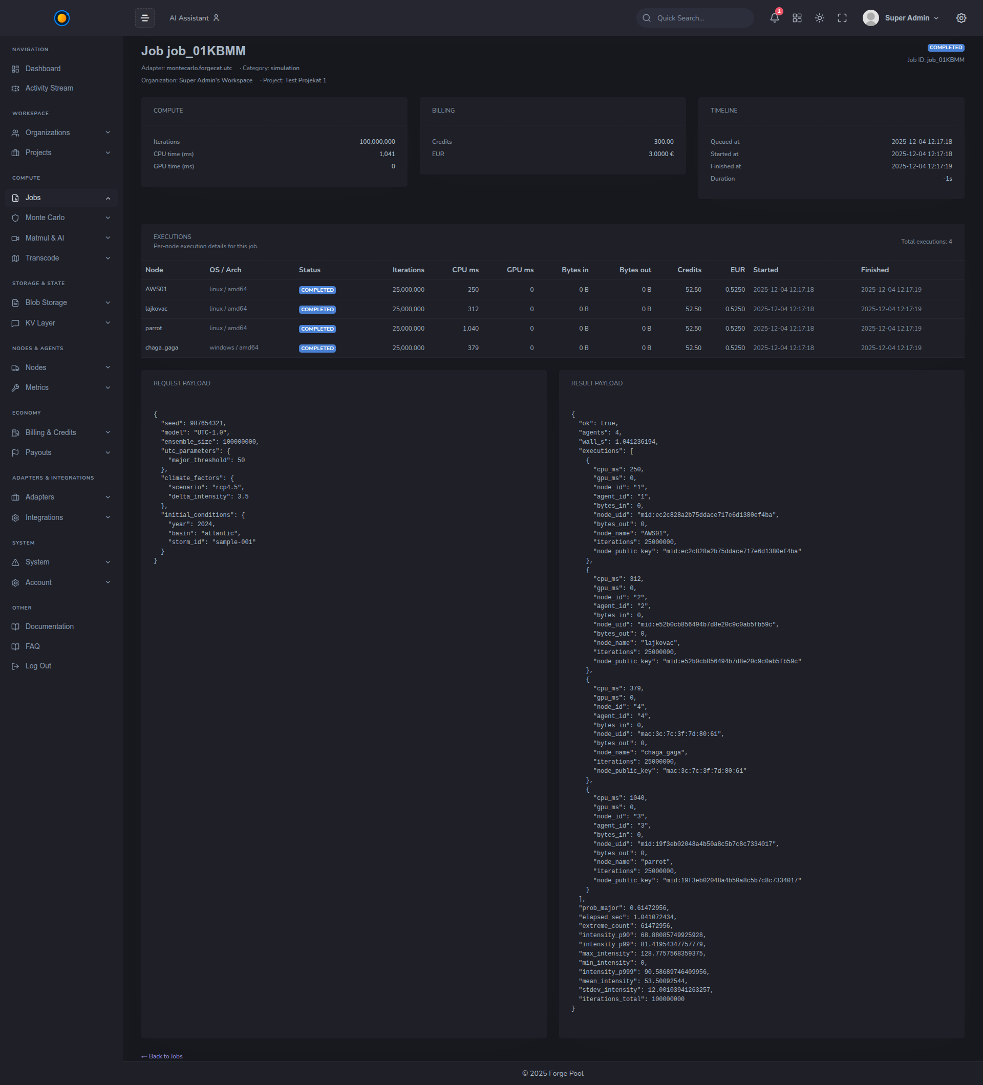
8. Recent Compute Jobs
A table listing the last N jobs for this organization:
- job ID,
- adapter name,
- status,
- duration / elapsed time,
- credits spent,
- started timestamp.
Click any row to open the full job detail view, where you’ll see:
- shard plan,
- participating agents,
- verification results,
- raw JSON response.
This is the main entry point for debugging and audits.
9. Top Nodes by Contribution (24h)
A ranking of nodes that contributed the most compute in the last 24 hours:
- node hostname / label,
- OS / architecture,
- jobs executed,
- CPU ms,
- GPU ms.
For providers, this view is a simple way to:
- see which machines are pulling their weight,
- spot underutilized nodes,
- correlate earnings with actual usage.
10. Time Ranges & Filters
Most charts have a time selector:
- Last 24h, Last 7 days, Last 30 days.
Future iterations may include filtering by:
- adapter,
- project,
- region.
Use these to zoom from “global health” to “this week’s Monte Carlo launch” in a few clicks.
11. Where to Go Next
From the Dashboard, typical flows are:
Integrators / clients:
- go to Projects → API Keys and wire Forge into your app,
- then watch jobs appear under Jobs → Recent jobs.
Providers / node operators:
- go to Nodes → Metrics to monitor your hardware,
- and Nodes → Earnings to track payouts.
Architects / leads:
- explore Adapters, Economy → Credits, and FAQ to plan broader rollout across teams.
The Dashboard is your “mission control” – once it makes sense, the rest of Forge Pool feels like operating a single, planetary-scale computer.